These guidelines ensure that all GDG Bandung communications, whether from organizers, partners, or community members, maintain a consistent and professional appearance that reflects our connection to the global Google Developer community.
While the horizontal logo is preferred, the stacked logo can be used as an alternative when space is a limiting factor.
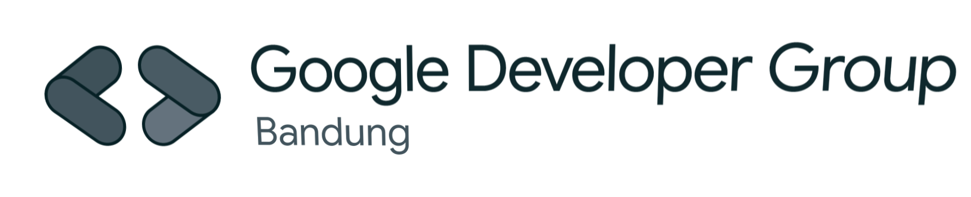
Horizontal Logo (Preferred)
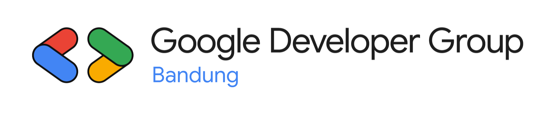
Light Background
Use on light backgrounds and white surfaces
Dark Background
Use on dark backgrounds and colored surfaces
Use horizontal format whenever possible for maximum brand recognition and visual impact.
Stacked Logo (Alternative)

Light Background
Stacked version for light backgrounds

Dark Background
Stacked version for dark backgrounds
Use stacked format when horizontal space is limited or for square format applications.
Google Developer Groups use specific typography to maintain consistency with Google's design system.
Google Sans - Main Typeface
Is the main typeface. Use a combination of bold and regular for titles or large sentences, so that the design is not too heavy.
For paragraphs with smaller type point, use the Regular variable.
Google Sans Normal
Google Sans Bold
Google Sans Mono - Secondary Typeface
Is the secondary typeface and its function is to bring variety and the perception of "code-style writing" to the piece.
It is used for short lines, talent names or additional data in small scale use.
Google Sans Mono Normal
Google Sans Mono Bold
GDG Bandung uses Google's official brand colors to maintain consistency with the global Google Developer community. We started from the core color and went towards more pastel colors, without losing the brightness and saturation.
Core Colors
Blue 500
#4285f4
Primary brand color
Green 500
#34a853
Success and growth
Yellow 600
#f9ab00
Attention and energy
Red 500
#ea4335
Alerts and emphasis
Halftones
Halftone Blue
#57caff
Halftone Green
#5cdb6d
Halftone Yellow
#ffd427
Halftone Red
#ff7daf
Pastels
Pastel Blue
#c3ecf6
Pastel Green
#ccf6c5
Pastel Yellow
#ffe7a5
Pastel Red
#f8d8d8
Grayscale
Off White
#f0f0f0
Black 02
#1e1e1e
Color Usage Notes
- • Use RGB values for digital applications (web, mobile, digital displays)
- • For print materials, refer to PANTONE color codes when available
- • Maintain sufficient contrast ratios for accessibility compliance
- • Click any color above to copy its hex code to your clipboard
Follow these guidelines to ensure proper use of the GDG logo and maintain brand integrity.
Don'ts
Do not change the colors and shape.
Do not recolor the secondary logo for light-colored backgrounds.

Do not apply any effects.
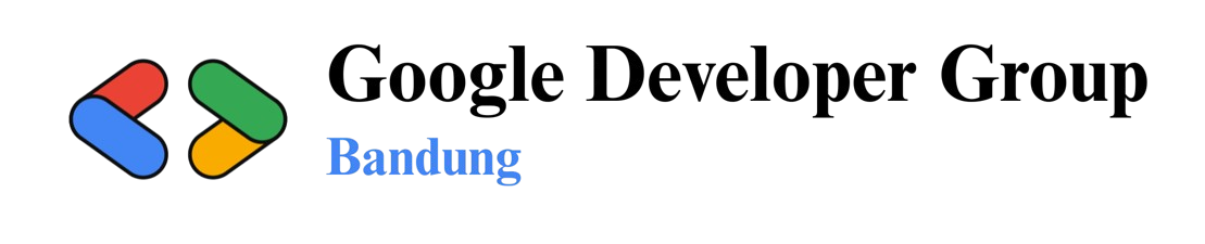
Do not use a different font.
These brand guidelines are based on official Google Developer Groups standards. Please check this page for updates and download the most recent logo files from our official repository.